01
Slurpee Design System
7-ElevenDesign SystemShipped
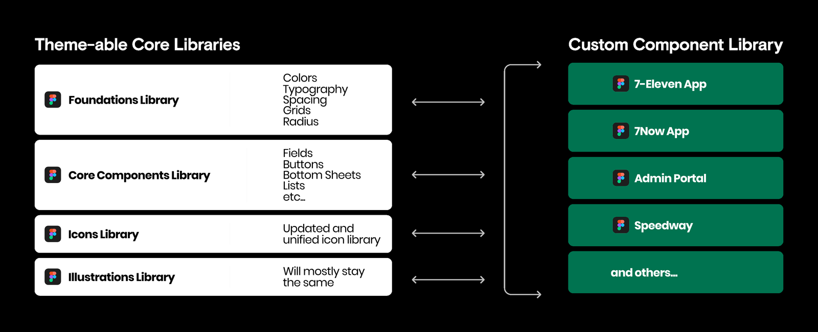
Rebuilt a single-app component library into a theming system that serves 15+ apps.
Recent and notable projects. Drag to browse.
Rebuilt a single-app component library into a theming system that serves 15+ apps.
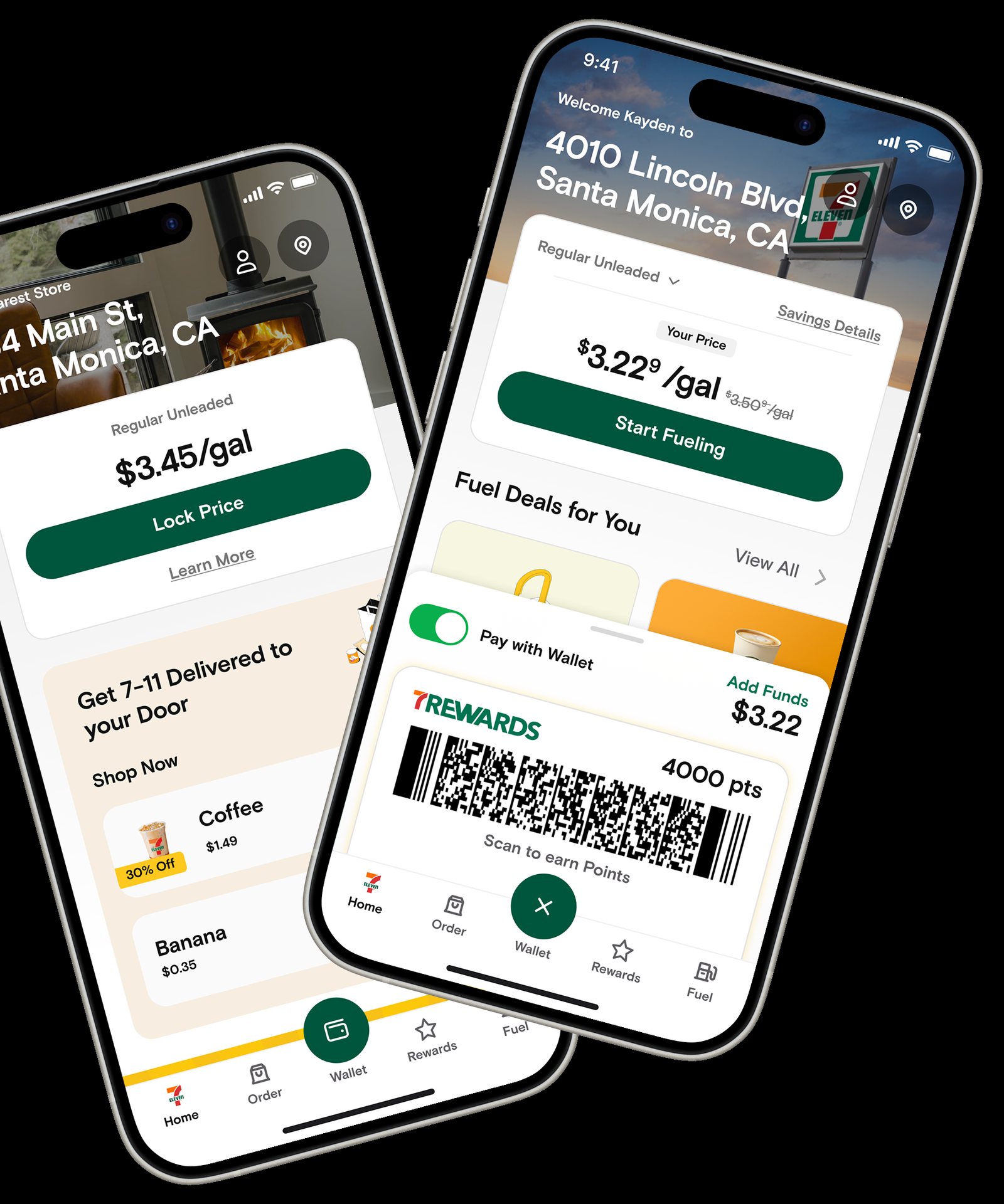
Redesigned the home screen around modular sections that adapt to each customer.
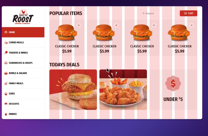
Designed a self-service ordering kiosk for a restaurant chain on a compressed timeline.
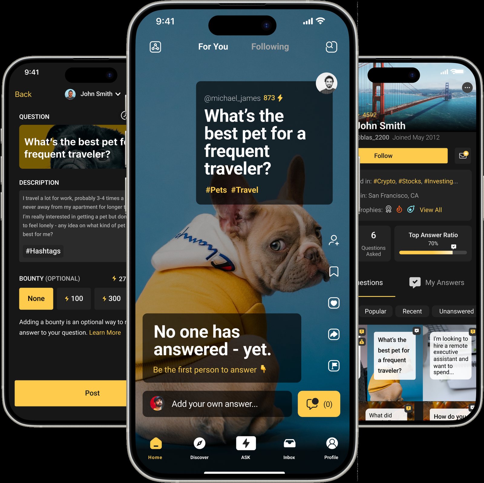
A gesture-based Q&A concept. It never launched. The interaction model is worth showing anyway.
I am a lead UX designer with 10+ years of experience. I build design systems and the products that run on them. Currently at 7-Eleven, where I lead the Slurpee Design System. More about me →
7-Eleven had a design system built for one app and fifteen apps that needed one. I rebuilt it from the ground up.
The original system grew out of a redesign of the main consumer app. I was the sole designer. I built it, maintained it, and documented it with limited resources. It predated Figma variables and properties, so it ran on component variants. It worked, but it was brittle.
It was built for one app. Other teams needed their own solutions. They detached components. They built one-offs. The Figma library filled with unused components. Design drifted. Engineering duplicated work. Velocity dropped.
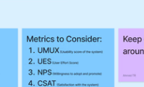
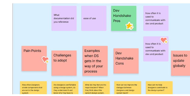
I started with my own assumptions about what worked and what did not. Then I tested them. Surveys. Interviews. A full audit of the libraries. The audit confirmed the worst of it: components that did not work across apps, components too complex to use, and a library full of dead weight.
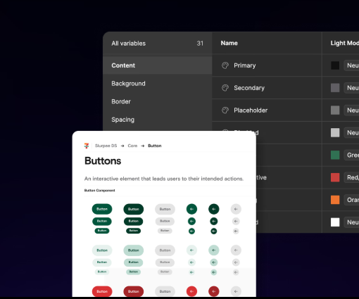
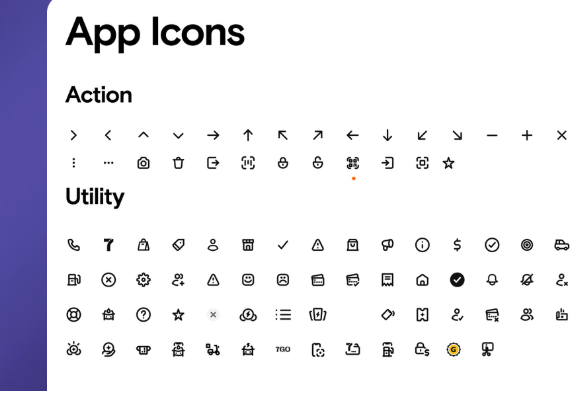
Two layers. Core libraries hold the foundations: text styles, core components, icons, assets. Every app uses them. Domain libraries sit on top. Each app gets its own library with its own theming: colors, spacing, corner radius. Plus components only that app needs. Nothing app-specific leaks into core.

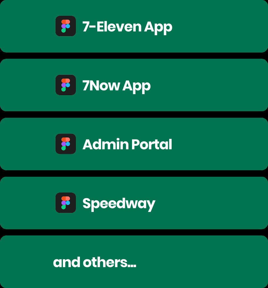
The Speedway app was the first proof. I trained their designer to build app-specific components with Figma variables. They got independence. The system kept its integrity. That pattern scaled.
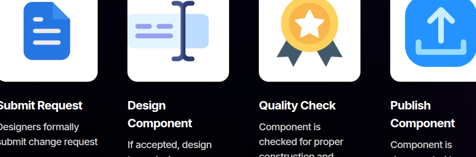
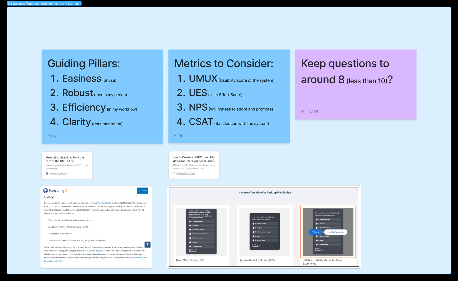
Designers submit a short form for new or changed components. We review it in a standing meeting. Accepted work goes to a backlog. Core components are handled by the design ops team. App-specific ones are handled by app teams. Everything gets a final check for construction and accessibility before it ships.
Teams adopted the new system faster than I expected. The Speedway app launched on a tight deadline with full brand consistency. Enterprise products migrated. Component simplification drove adherence: better consistency, faster development, shorter time to market. What started as one app’s design language is now the foundation for 7-Eleven’s digital presence.
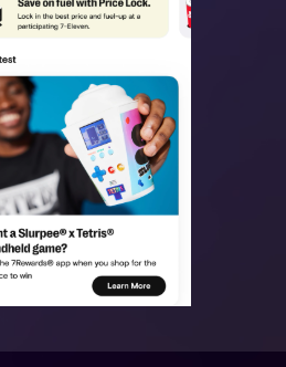
The 7-Eleven home screen was a billboard. Marketing owned the top of the screen. Customers scrolled past it to do anything useful.
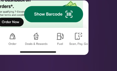
Bold promos and seasonal campaigns took the prime real estate. Customers scrolled through marketing to reach the tools they came for. The bottom navigation was worse. Location-specific features wasted permanent slots. Critical features were buried in banners that users had trained themselves to ignore.
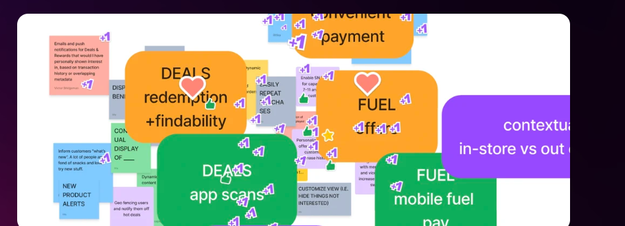
We ran a workshop to set priorities. Two themes emerged: let customers customize the screen, and surface the features nobody could find.
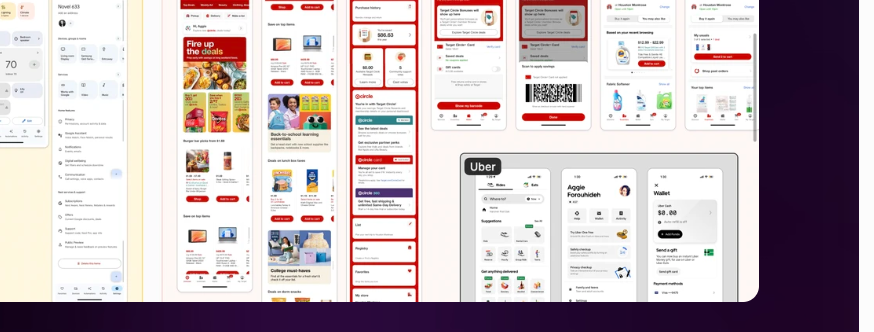
We looked at how other apps handled it. The pattern was consistent: modular sections that can be rearranged, content that changes by location or habit, and a clear visual hierarchy between primary actions and secondary content.
The home screen became a set of modules. Each module is self-contained: fuel prices, food ordering, rewards. Modules can be added, removed, or rearranged. New services plug in without a redesign.
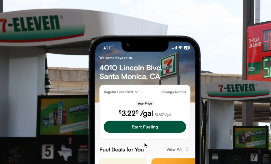
The top of the screen holds one primary action. It changes with context: fueling at the pump, ordering food nearby, checking in at a store. The screen adapts to the situation instead of showing everyone the same billboard.
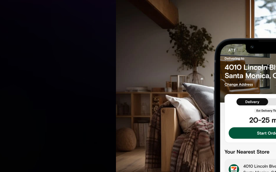
Usability tests came back positive. The modular approach changed how the team thought about the app beyond one screen.

The previous designer left mid-project. The team needed a full kiosk ordering experience, fast. I came in to finish it.
A restaurant chain needed a self-service kiosk interface. The timeline was tight and the design seat was empty. I came in to get it done.
I mapped the full ordering flow first: standard menu orders and custom meal builds. Getting the flows on paper early exposed the friction points before any screens existed.
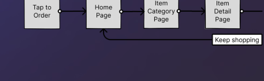
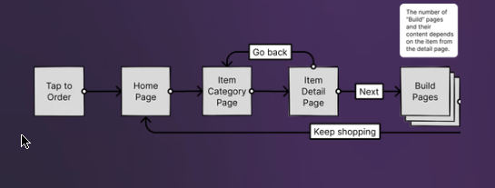
We ran a workshop on the competitive landscape: what exists, what works, what does not. The findings became the plan for the best MVP the timeline allowed.
I think in systems, so I started with the grid. A flexible layout for the home screen that handles any number of promos and resizes components dynamically. Marketing can add seasonal promotions without a redesign.
Product detail and listing pages were built on the Slurpee Design System. New food-ordering components, like customization panels for toppings, were designed as reusable library additions. I reused core components like steppers instead of building one-offs. The result: no orphan components, a smooth handoff, and fewer blockers for engineering.
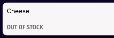
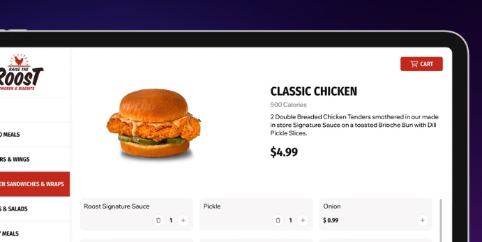
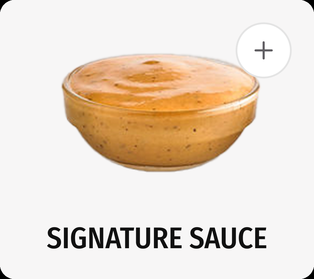
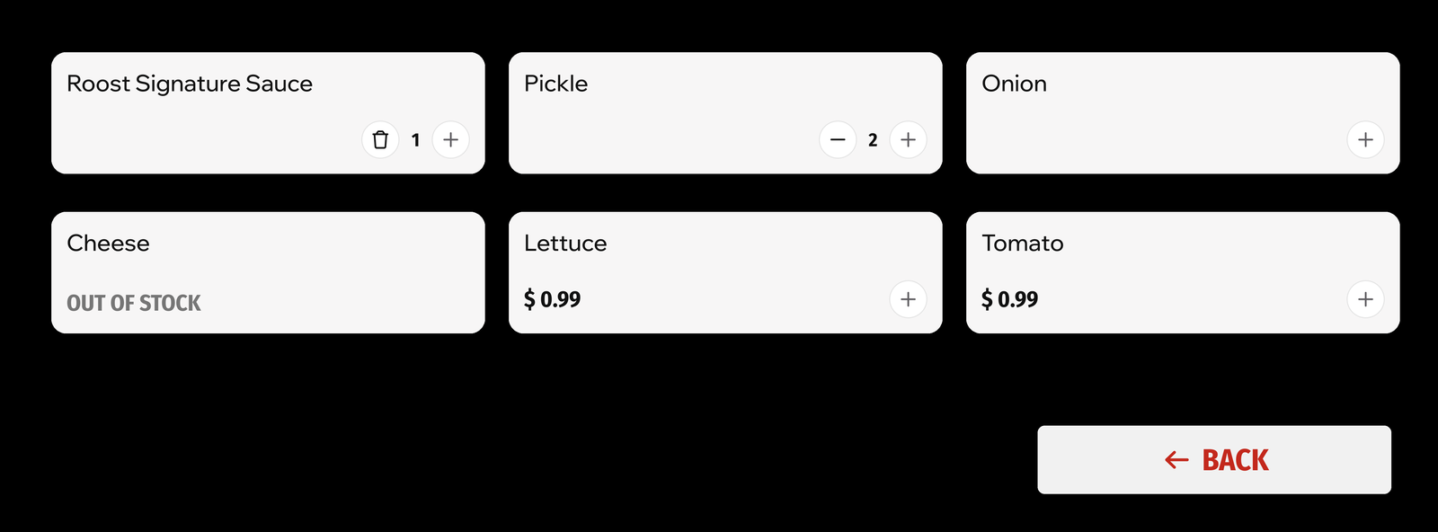
We shipped on time. In-store orders rose 49 percent. Early data showed faster order completion and higher add-on sales from promo placement. The new design team inherited a system they could maintain and extend.
Under a tight deadline, the systems approach is not slower. It is faster. Reuse the library. Build flexibility in early. Document everything so the next designer is not starting blind.
Solvr was a Q and A app built around a simple idea: if asking and answering felt as easy as scrolling a feed, more people would do it. It never launched.
Traditional Q and A is text-heavy and intimidating. We designed around gestures people already know: swipe to browse, tap to answer.
Questions arrive as a vertical feed. Swipe through them. Save, share, or answer from the card itself. No navigation maze.
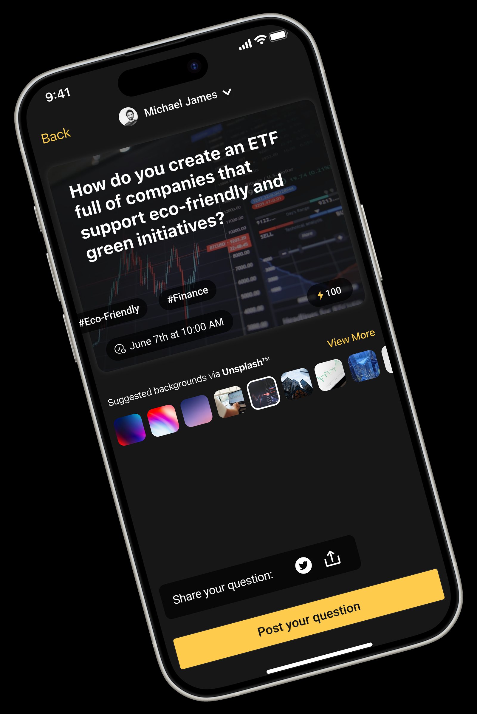
The composer stays minimal: text, an optional image, topic tags, a preview. Nothing between the thought and the post.
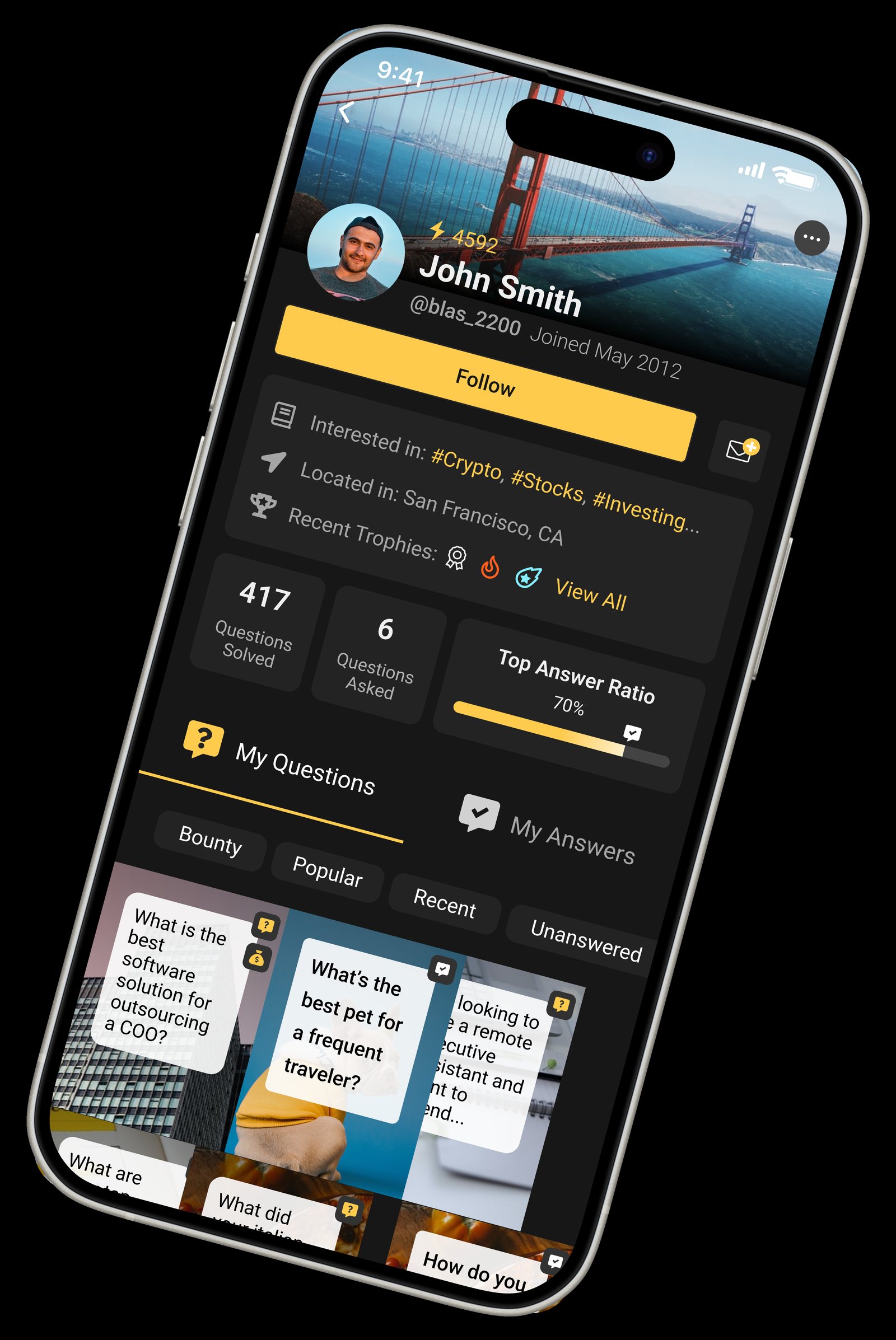
Engagement history, questions asked and answered, achievements. Light gamification to reward participation.
Reducing UI complexity lowers the barrier to entry. Familiar gestures cut the learning curve. Visuals beat walls of text for retention. None of this is radical. It is just rarely applied to Q and A.
The product did not launch. The exploration still has value: a working model of what gesture-based, content-first Q and A could feel like.
I am a lead UX designer with 10+ years of experience. I build design systems and the products that run on them. Currently at 7-Eleven, where I lead the Slurpee Design System across 15+ consumer and enterprise apps.
University of Texas at Dallas, Dallas TX. Bachelor of Arts in Arts and Technology.